

AirAsia Travelmall
Enhancing duty-free online retail platform based on comprehensive user research and heuristic evaluation to improve usability and increase conversion rates
UX / UI Design, Research 2022
Background
AirAsia Travelmall is an online retail platform developed by AirAsia, a low-cost airline based in Malaysia. The platform aims to redefine the duty-free, travel, and overseas retail shopping experience by offering a wide range of products, including cosmetics, perfumes, liquor, tobacco, and other duty-free items. AirAsia Travelmall allows customers to pre-order duty-free products before their flight, and have them delivered to them on board or at their destination.
Since its launch, AirAsia travelmall has a low traffic count with low conversion rate as well as low sales.
A number of solutions have been tried but there is no significant success i.e., stakeholders interview, improving information architecture and design iterations.
The team has been tasked to evaluate users’ pain points and to design solutions to address them.
Increased user engagement
Incorporated features to boost user engagement and encourage further exploration of the website
Improved brand perception
Improved the visual appeal of the design, potentially enhancing users' perceptions of the AirAsia brand
Problem
Role
UX / UI designer
Impact
See the platform here
Skills Demonstrated
Heuristics Evaluation, Online Survey, User Interviews, Competitive Analysis, Affinity Mapping, User Flow, Wireframing, Usability Testing, Prototyping.

How might we create a hassle-free and intuitive shopping experience on AirAsia travelmall so that we can attract new users and motivate them to complete purchases.
Problem Statement
Research and Define
Research Objectives
Understand what is stopping new airasia travelmall users from using the site
Evaluate existing user flow for travelmall site and identify pain points for anyone who might be interested to buy duty-free
Competitive Analysis
We conducted a competitive analysis of Travelmall’s competitors - i.e. other online duty-free retailers, to better understand their strengths and weaknesses. Competitors that we analysed are KingPower, ishopChangi, and Sephora. Through this competitive analysis, we could picture where Travelmall stands in the market.


Wide range of products
Equal percentage of male and female visitors
Have strong brand identity
Clean design
Consistent design features and useful icons
Provide a clear overview of brands available
Language options
Search filters
Search for duty free and non-duty free products through a dropdown menu
Have clear and concise product description
Highlighting key information
Clear indication of price
Savings
Product reviews
Checkout is a 3-step process
Overall
Website
Homepage
Product page
Heuristic Evaluation
We were able to identify and evaluate specific issues with the Travelmall website, such as usability problems, navigation issues, and design shortcomings. This process helped us to see the problems from the perspective of the user, which can be valuable in identifying areas for improvement and making design decisions.
What did we learn
Confusing options for users
Poor feedback when clicking on certain links
Asking for unnecessary information from users
Issues with loading
Missing information
Missing navigation bar
Inconsistent product presentation, and no option to close the page
These issues result in a poor user experience:
User Interviews and UT
Findings
By organizing the key insights through affinity mapping, we identified various patterns, which were categorized as key friction points.
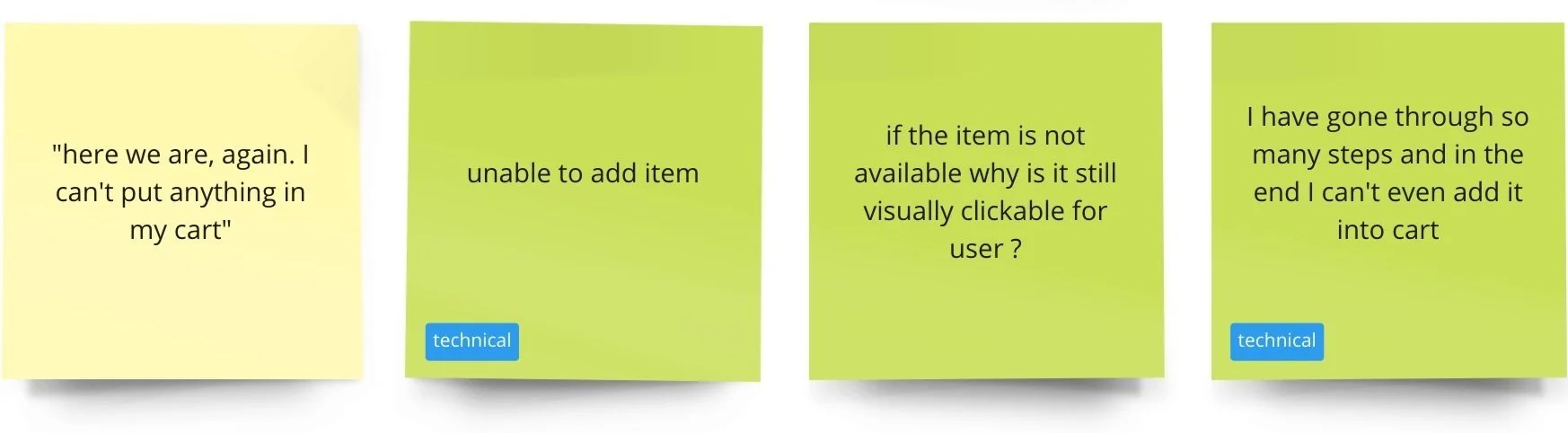
1. The appearance of the website and the product presentation makes it difficult for users to trust the platform and appear unappealing
2. The number of steps required to browse the product offerings is frustrating for users, and the different delivery methods makes it even more complicated
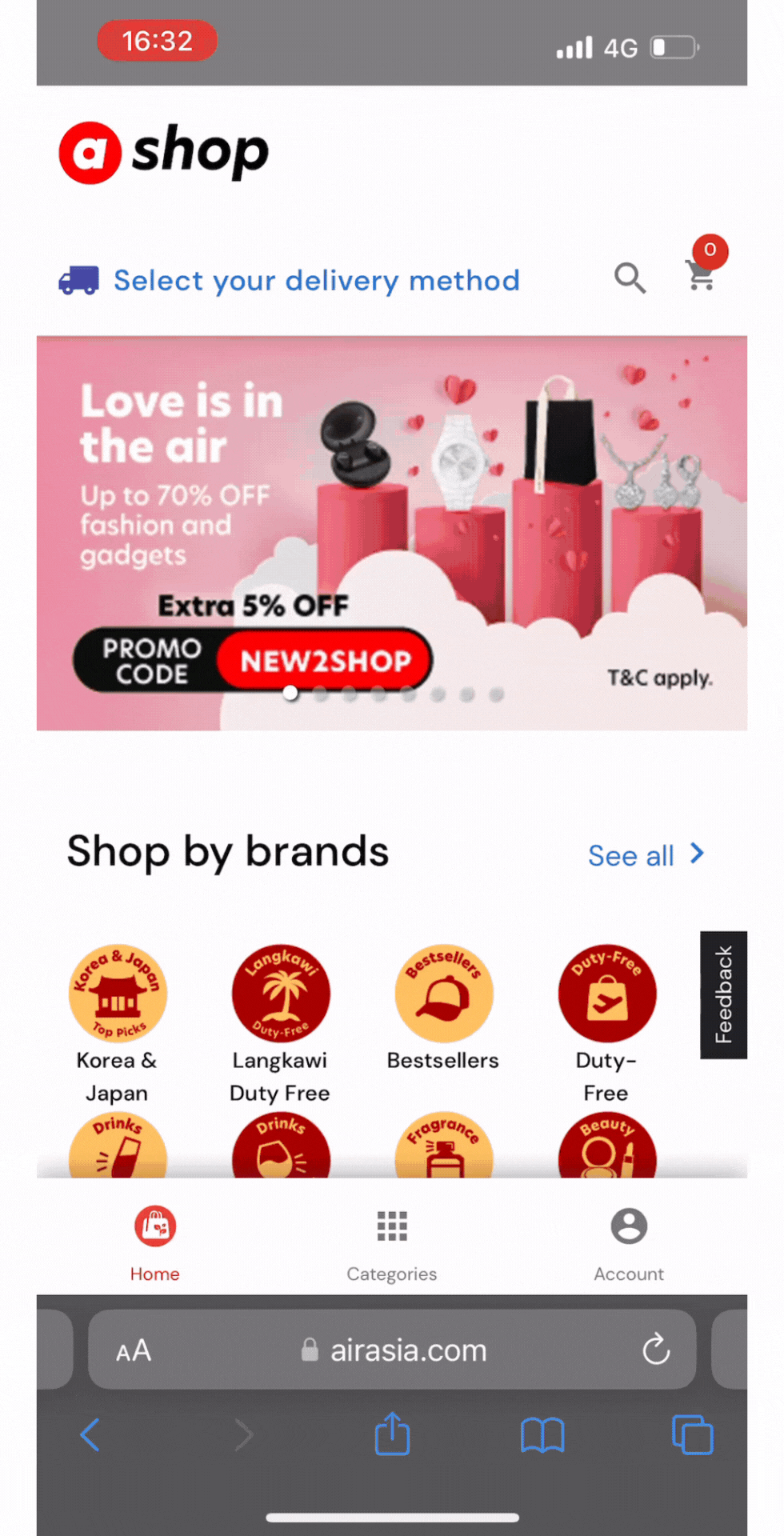
The current shopping experience requires users to enter their delivery information prior to browsing product listings, as opposed to the traditional process of entering it after carting out the product
As soon as users access the site, they are immediately presented with the choice of delivery method
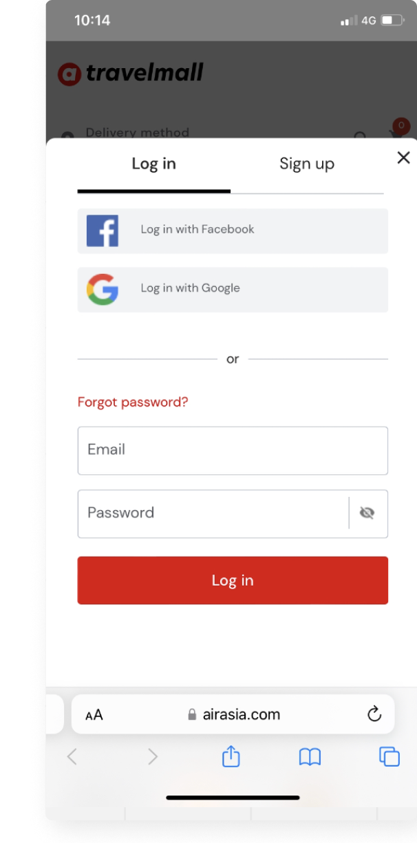
When adding items to the cart, users are required to log in with an account, which is intended to streamline the shopping experience later on. However, this deviates from the typical online shopping experience
3. Website not functioning properly, users experiencing difficulties browsing products
4. Users were disappointed by the lack of visible products and found the limited product range for certain collection methods confusing
5 of the 8 users were unable to add items to their cart after bypassing the multiple loops
Some users faced issues with website functionality
What do people purchase from Duty Free online? Why?
When do people complete their online Duty Free shopping?
How do people complete their Duty Free purchase on AirAsia Travelmall site? What do they like or dislike about the website?
What stops people from completing their Duty free purchase on AirAsia Travelmall site?
8 participants
3 Females, 5 males
Mix of Singaporeans
Malaysian Expats
1 Chinese
1 Japanese
25-45 years old
Working adults who have the earning power
New Users
Have done DF shopping before
Big Questions

A popup asking for personal information
Most of the items selected from the homepage are not available. This issue appeared on 90% of UT
This module appears in 30% of the UT. Due to challenges in previous sections, other users were not able to reach this part of the UT


Products that are displayed and available for purchase are based on the delivery method chosen. This results in users seeing error screens when browsing the site
What do we need to address
Ideation
Expand range of products to reduce undesirable flows
Improve on design which may create more appeal and evoke a greater sense of trust
Altering the flow user experience at the different stage of using Travelmall
Resolve technical errors + Look into error flows
Provide more information to aid DF shopping
Prioritising Design Solutions
As there are quite a few possible solutions, we decide to prioritise them based on the prioritization matrix
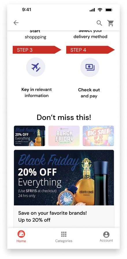
Observed User Flow (Current)
Suggested User Flow (New)
Optimizing User Flow
Suggested User Flow to simplify the process of browsing, selecting, and purchasing products online
This includes:
Reduced number of steps prior to browsing
Less frustration when product is not available
Reduced number of fields to fill in for delivery method at checkout
Lower chances of not seeing any products
Choosing collection method based on product
Reduce number of steps before adding to cart
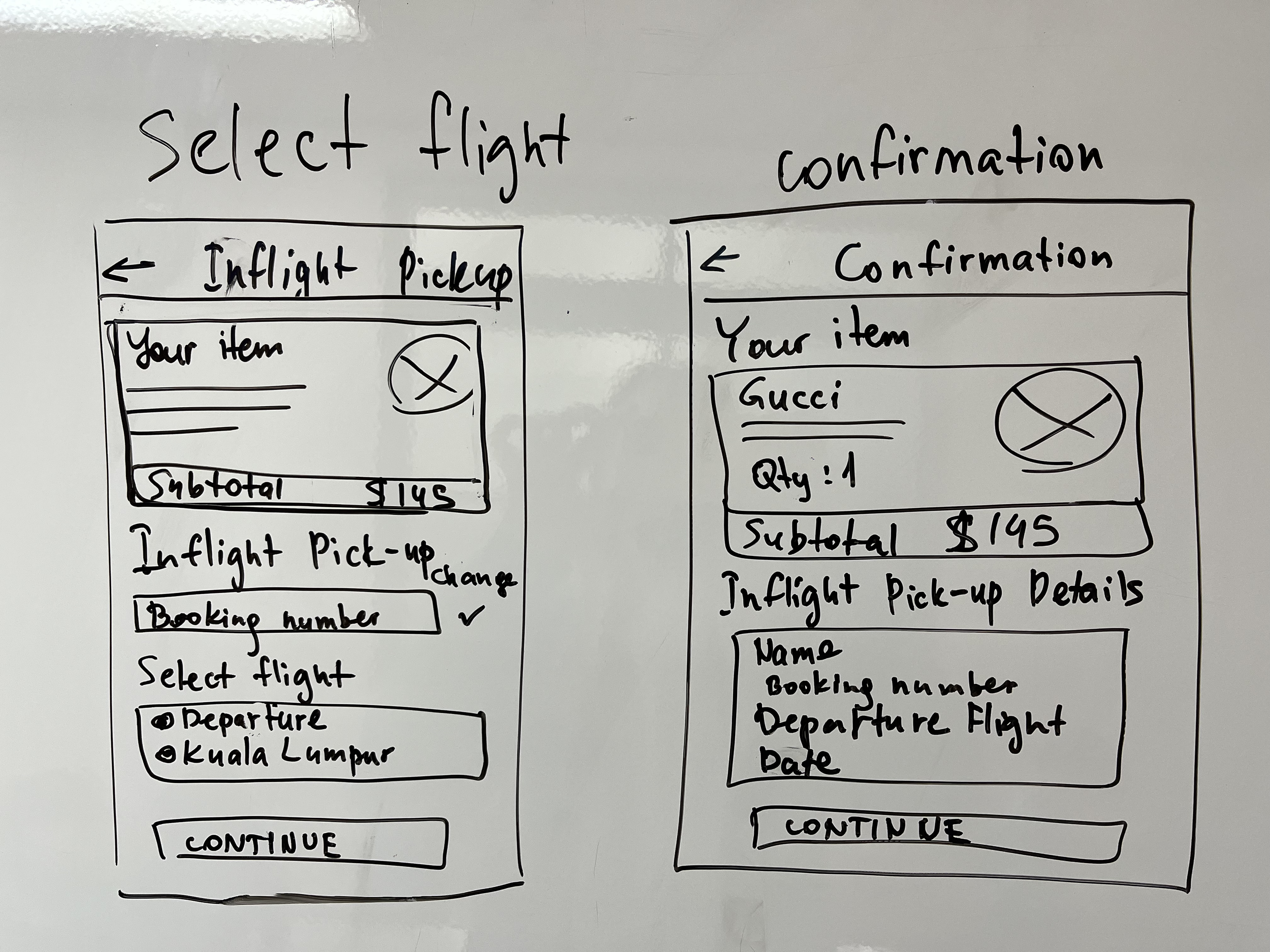
We efficiently developed a preliminary design through a collaborative sketching session. The main focus during this phase was determining the content and organizing it in a clear and organized layout.
We quickly built a Mid-fi prototype to test. We conducted usability tests to validate the workability of our designs.
Design


From lo-fi to mid-fi
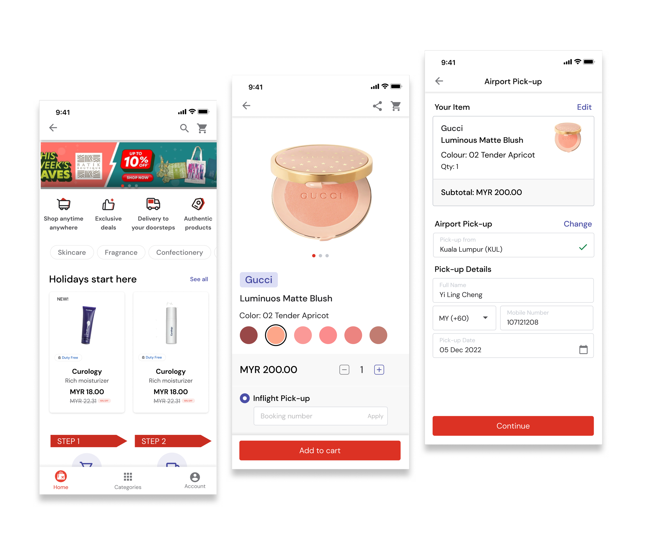
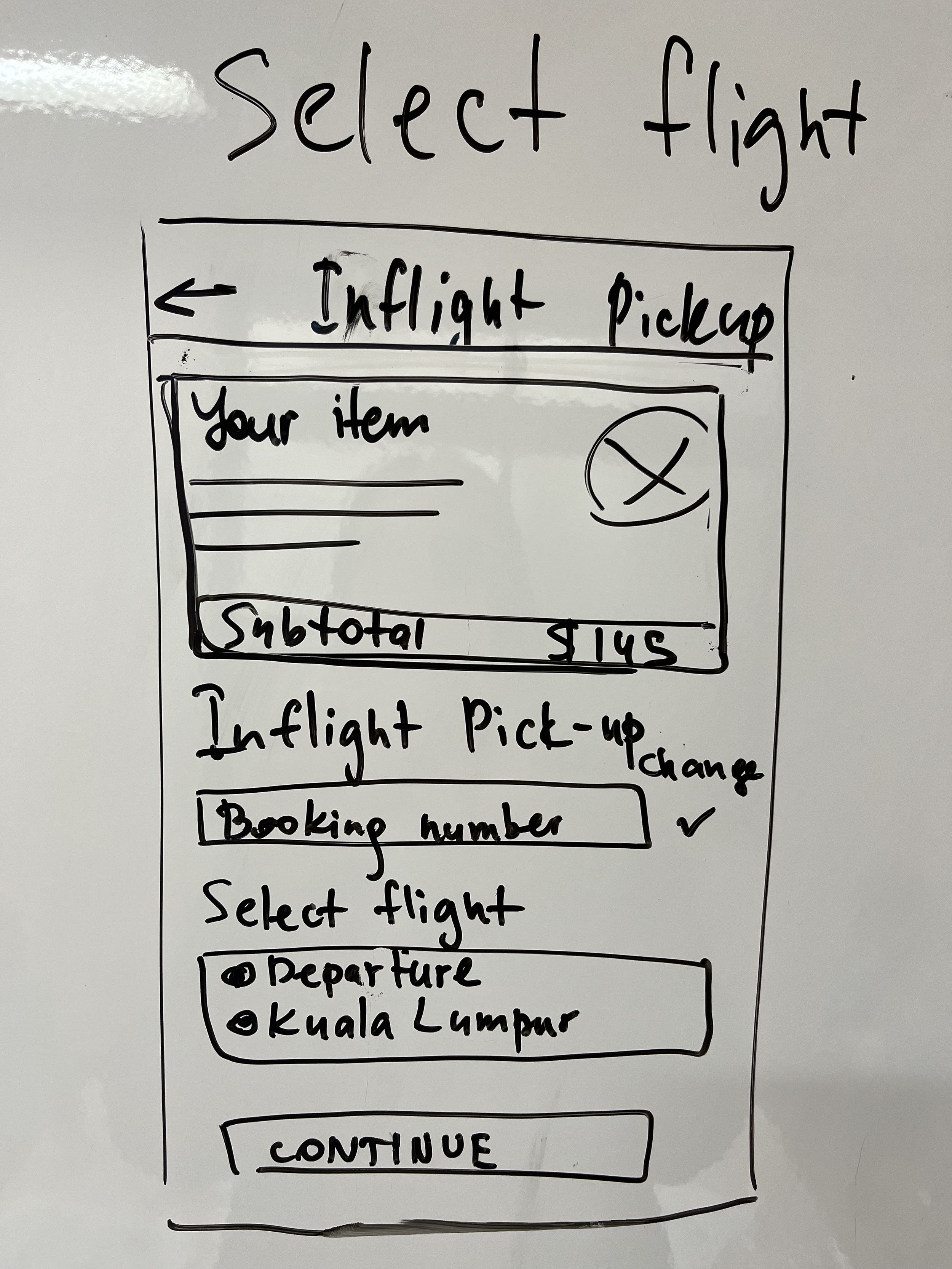
Checkout Design
Inflight Pick-Up
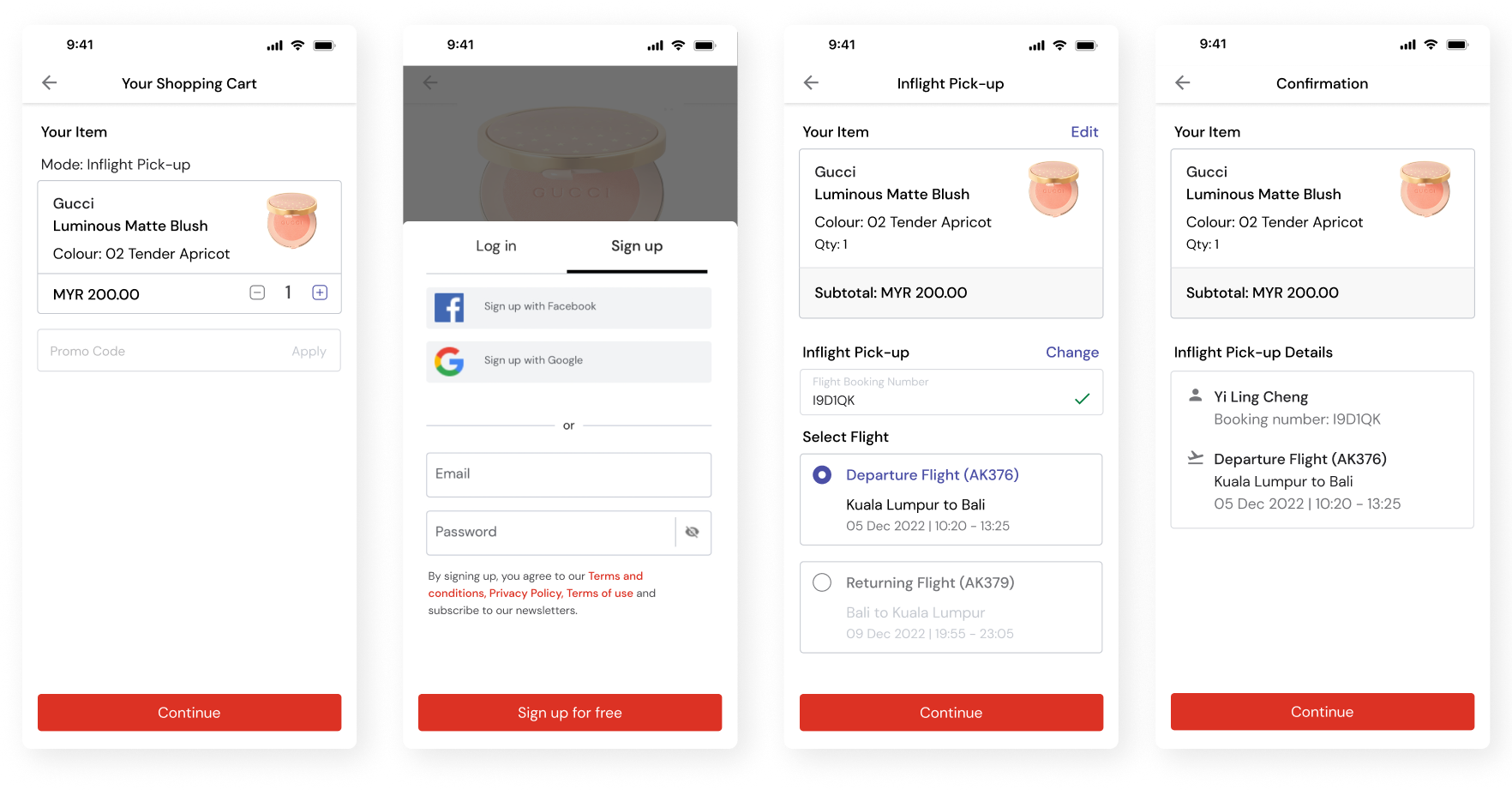
Key in the promo code (if any) and see total payable before committing to purchase
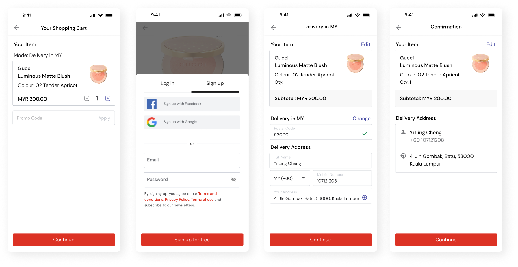
Delivery In MY (Previously: Home Delivery)
Airport Pick-up
Key in intended delivery address
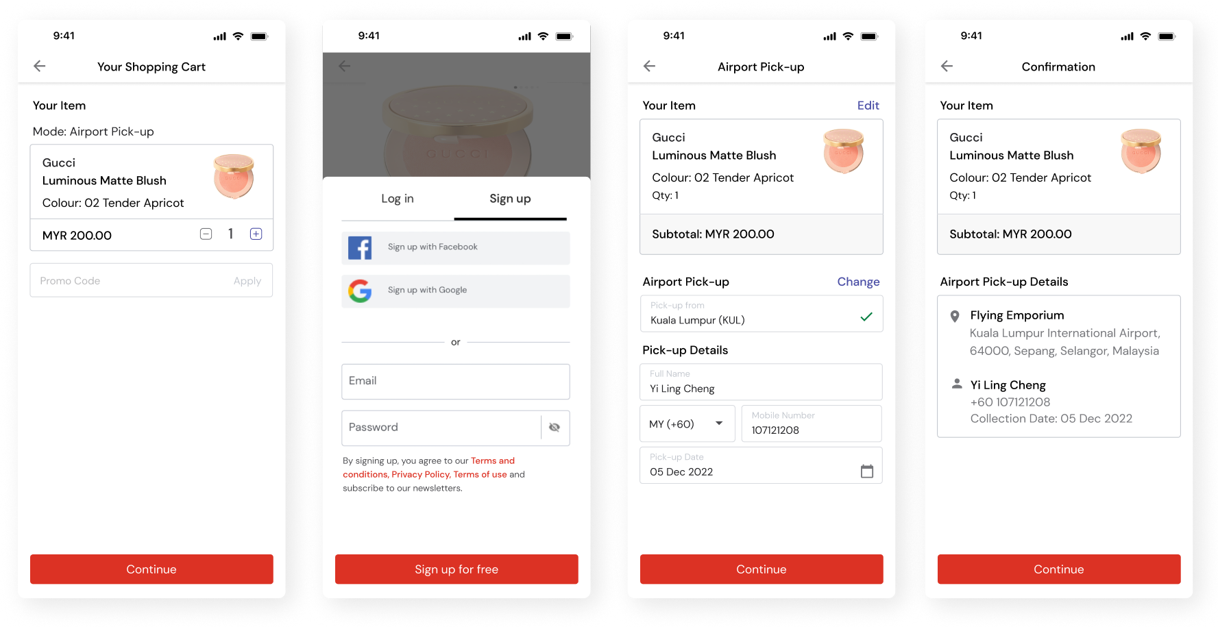
Key in preferred collection date and contact information
Departure/return flights are auto-populated once booking number is inputted
Review information before check out
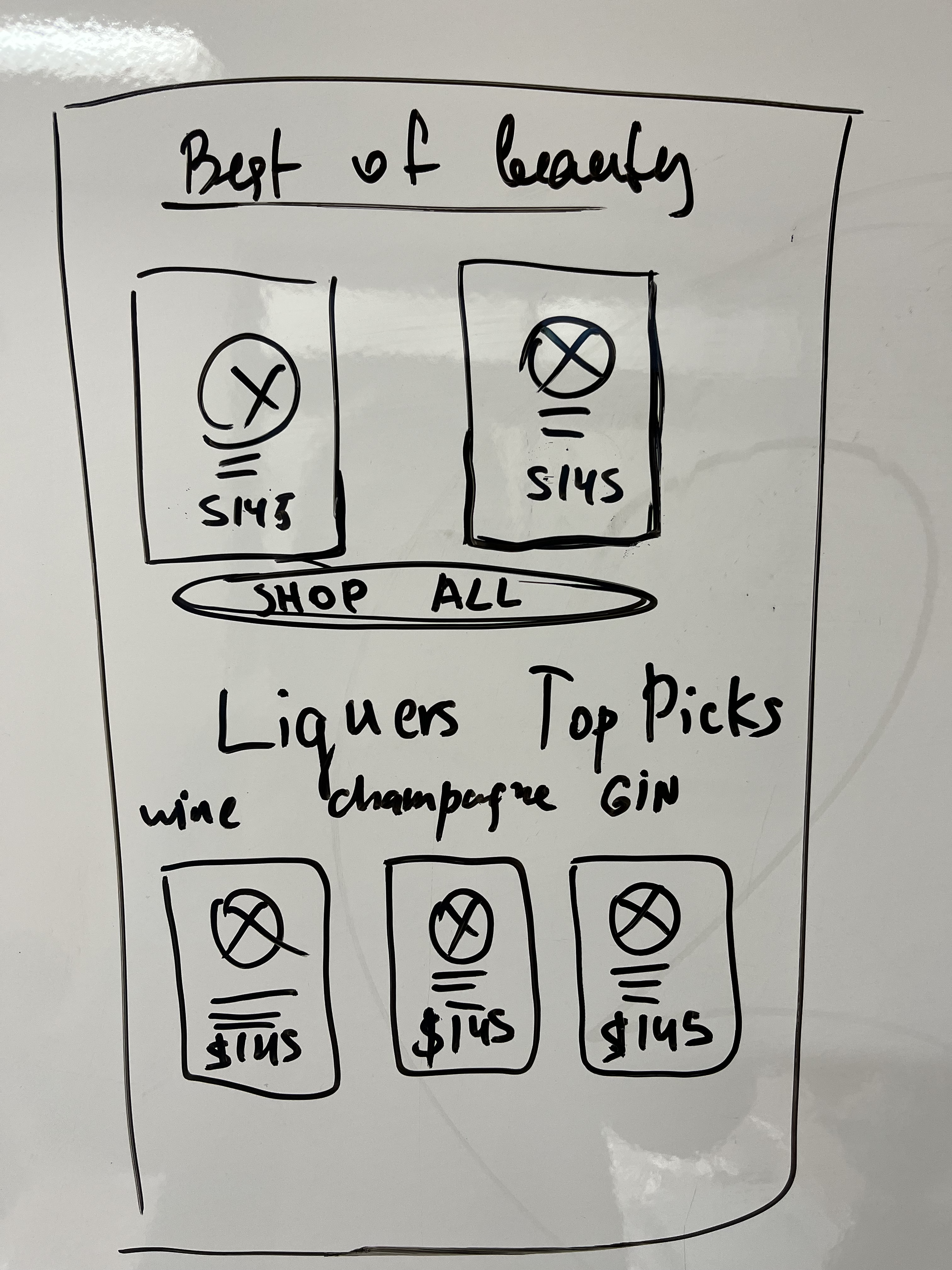
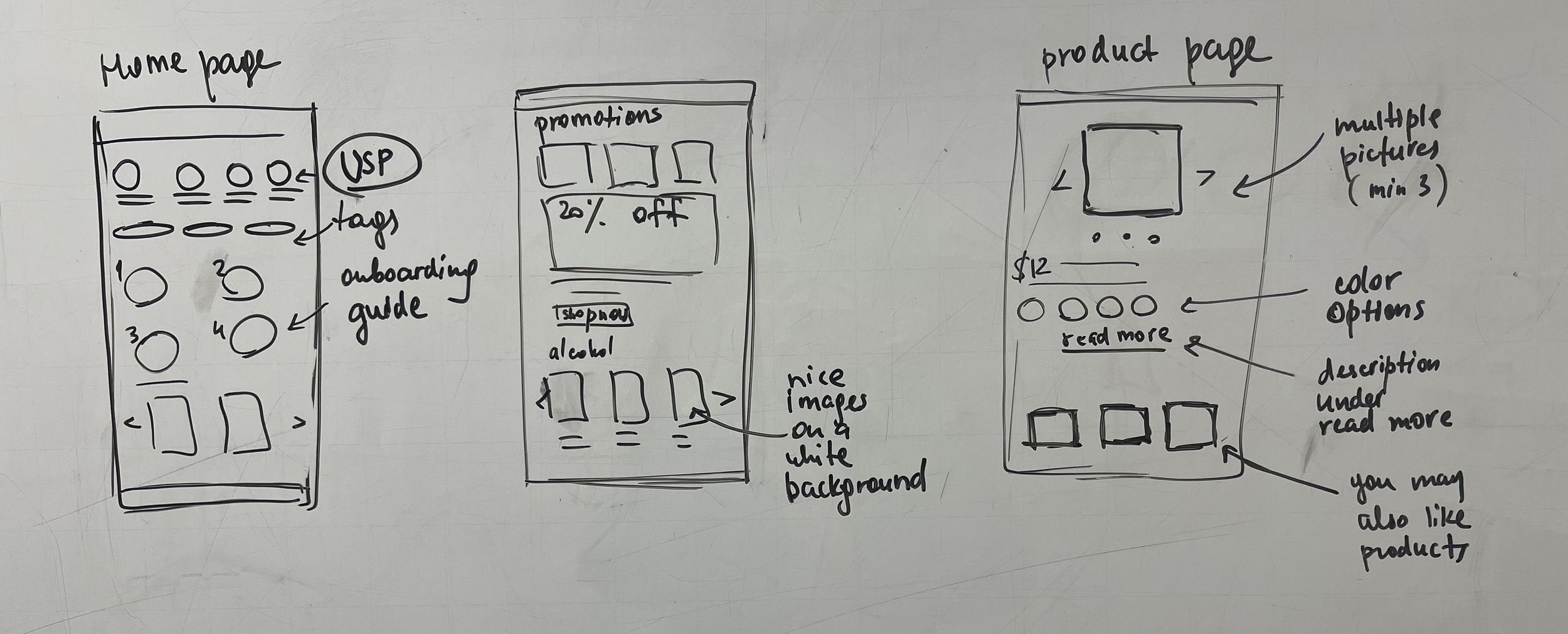
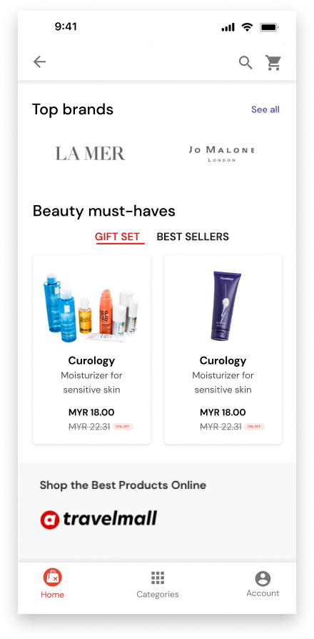
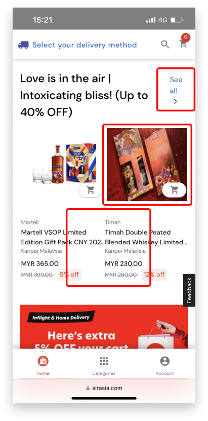
Homepage Design
Suggested Product Page Design

Text is not properly adjusted on mobile view. Makes it difficult for users to read and engage with the content
Inconsistent product images lead to confusion, reduce trust, and make it difficult for users to get an accurate sense of the product being offered
New

Brief shopping guide for the new users
Consolidated section to feature upcoming promotion and sales.
Users can see the different colour options for each product on the same page
Introduction of subcategories to allow users to toggle and look for products within the same page

Test and Validate
Reflection

Inconsistent visual hierarchy on product cards
Insufficient spacing between text can lead to poor readability and difficulty in distinguishing between different elements of the text
Featured brands are shifted down the page to bring users attention to the products
Users can easily find out the available delivery/pick-up modes that best fit their needs
Description and ingredients displaying only the key information while the detailed information is hidden under ‘read more’
Current design
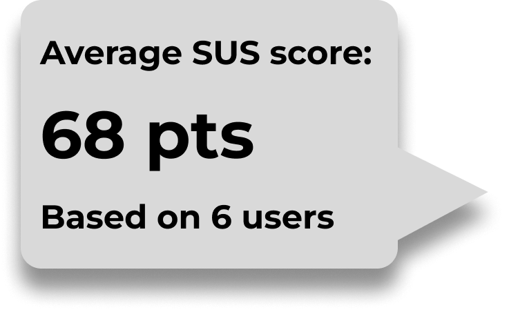
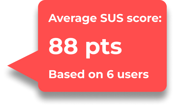
We conducted a second user test to validate the improvements we have made. Overall, the participants were satisfied and our SUS Score improved, from 68 to 88.
Old
AirAsia team's response to the UX audit of the AirAsia Travelmall was positive, as they were impressed by the comprehensive research conducted.
In hindsight, I would like to do another round of usability testing during the final stage
Iterate, iterate, and iterate. I always believe there is room for improvement
Good design doesn't happen in silos but rather in a collaborative environment
We had such a great time brainstorming, discussing, and building upon ideas with our teammates. Through this project, I learned a lot about project management, giving constructive feedback, and most importantly, listening to others
Maintain open communication with clients and stakeholders
Stakeholder management is extremely important right from the beginning of a design project. Having this in place helps manage expectations and scope of the project to avoid delays in key deliverables
New

USP added at the top to tell customers what makes Travelmall unique when compared to competitors
Defined cards with clear visual hierarchy accompanied with consistent products images
Multiple pictures of product