

ReturnOnTalent
B2B SaaS Landing Page Redesign
UX / UI Design, Research 2022
Skills demonstrated
User Interviews, Competitive Analysis, Affinity Mapping, Wireframing, Usability Testing, Prototyping
Background
ReturnOnTalent is an early-stage B2B SaaS product. It is designed to aid companies in managing internal employee mobility and identifying internal talent. The platform connects internal employees with internal job opportunities within the company.
Role
UX / UI designer
Problem
The current landing page design does not effectively convey the unique identity and value of the ReturnOnTalent product
The content is disorganized and not presented in a way that effectively communicates the product's key features, benefits and value proposition
The existing landing page for the ReturnOnTalent platform needs to be redesigned as a standalone landing page distinct from its current parent website: WeLinkTalent
- CEO & Co-Founder of WeLinkTalent (client)
Goals:
Make information relevant to all key user personas (HR, Hiring Manager, Senior Management)
Communicate the “Why”, “What”, and “How” of the platform
To encourage their target audience to learn more and book a demo with them
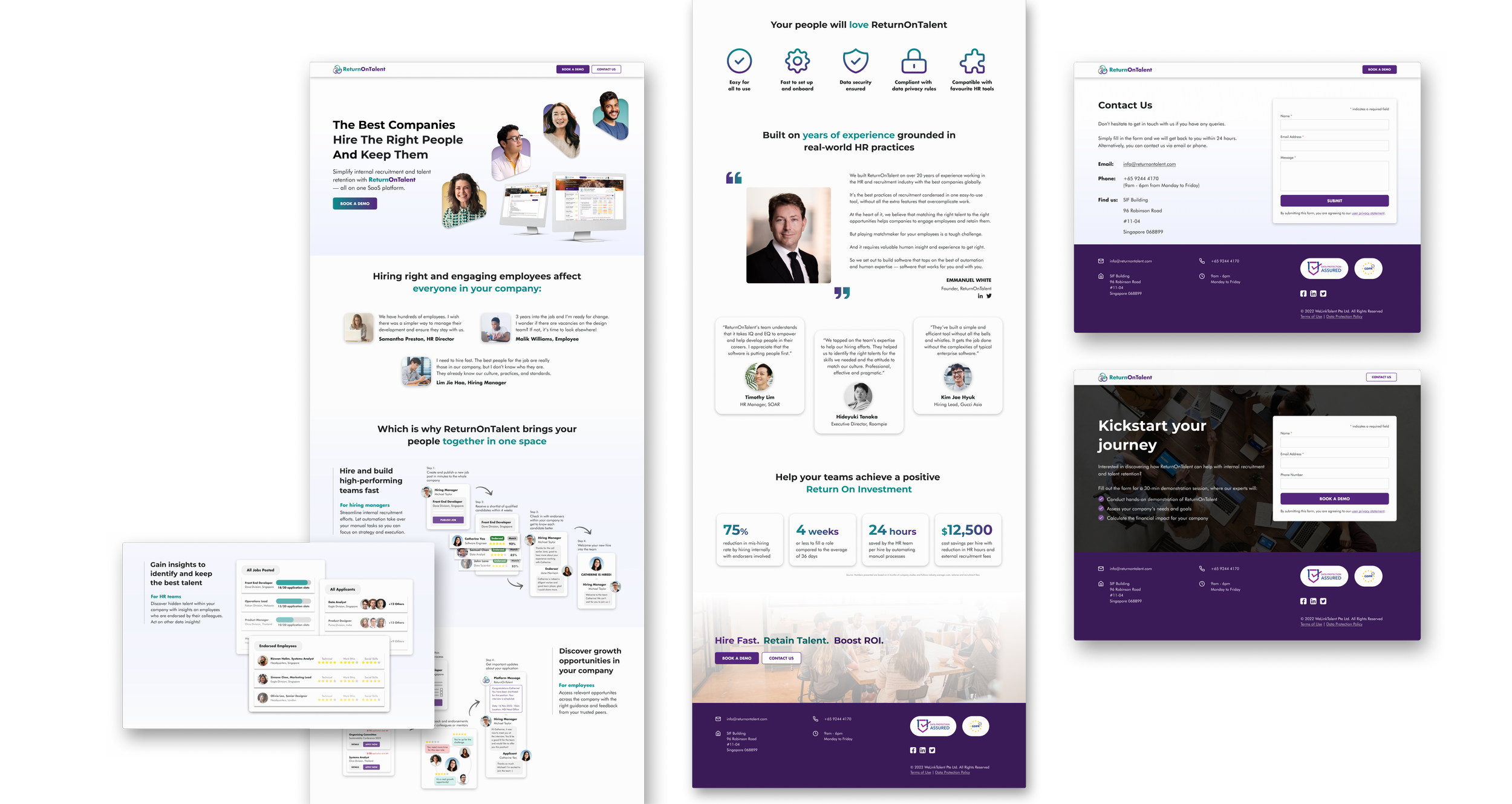
Solution
See the live site
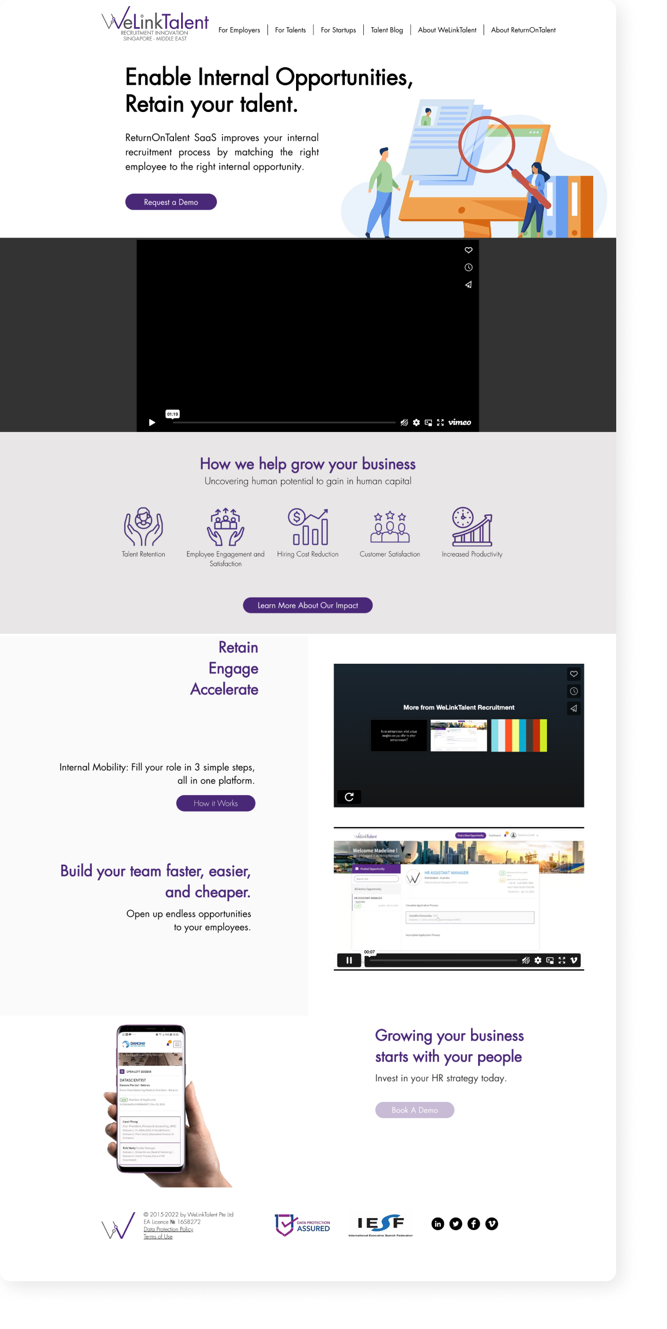
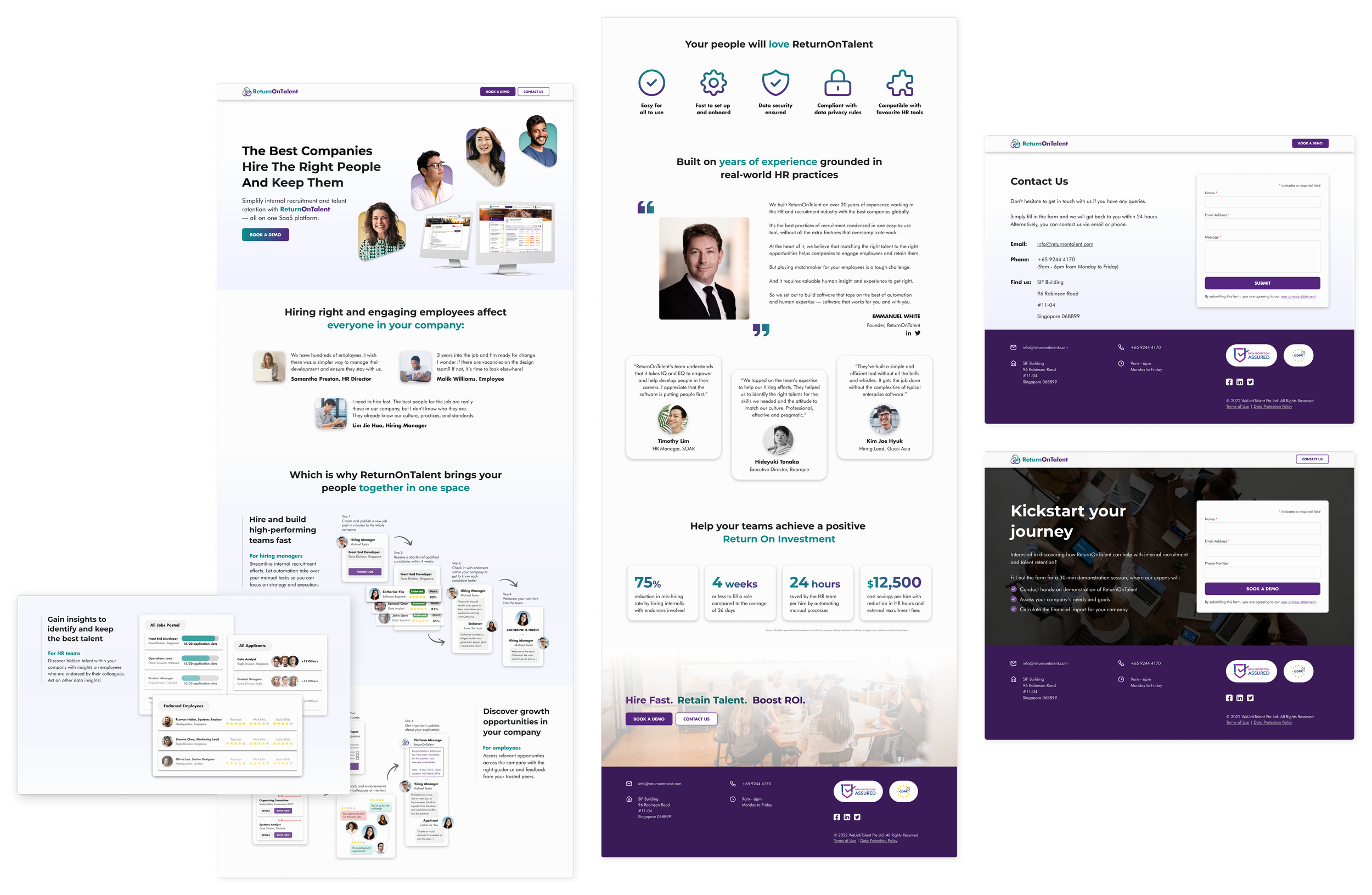
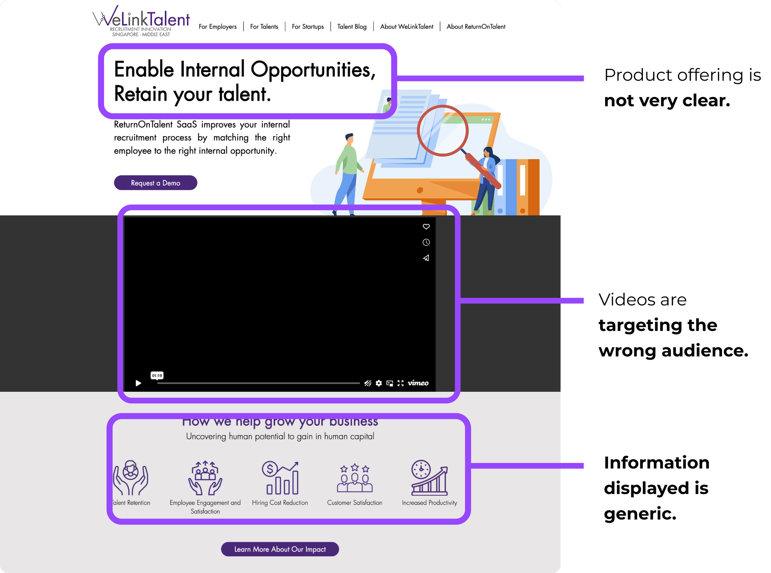
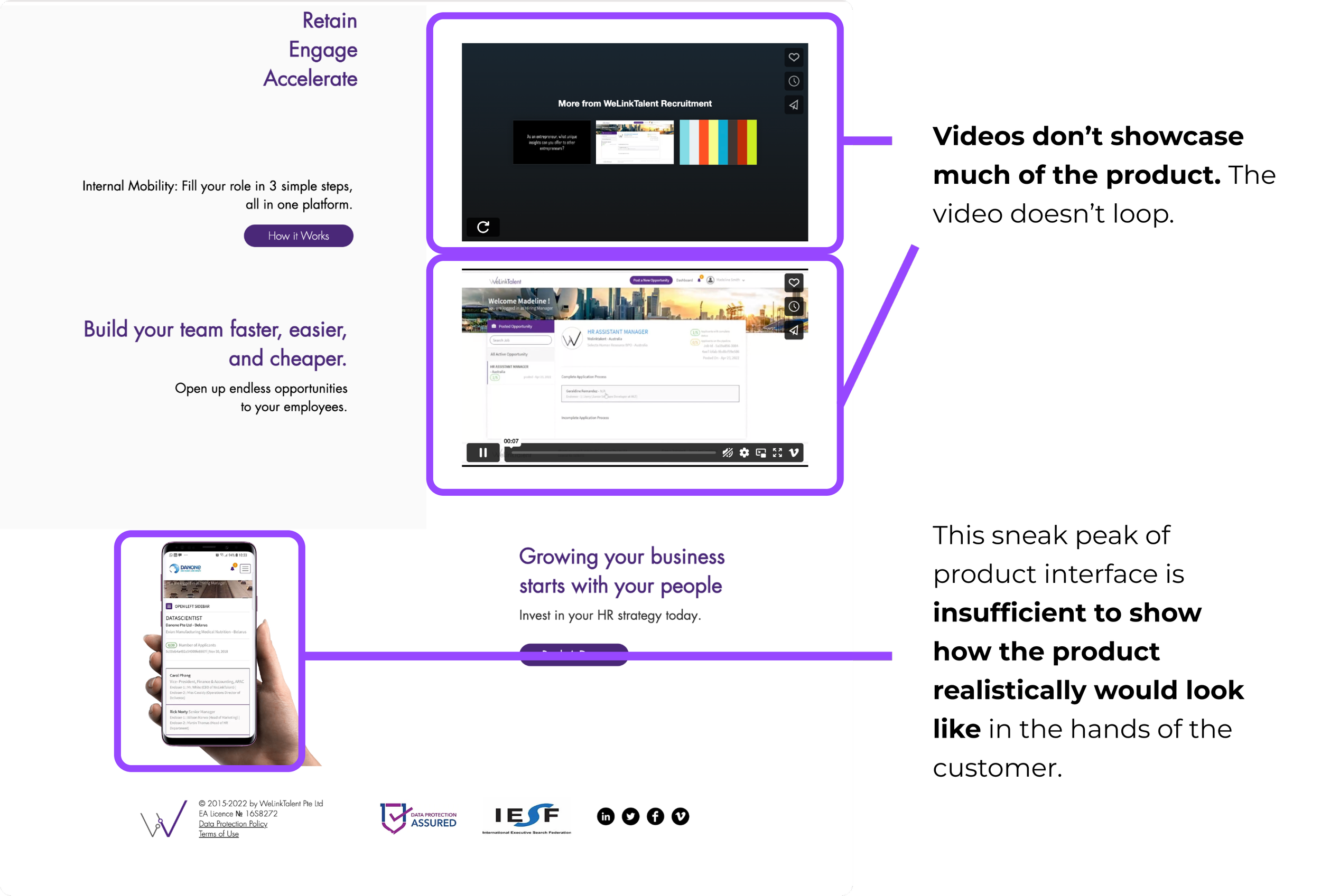
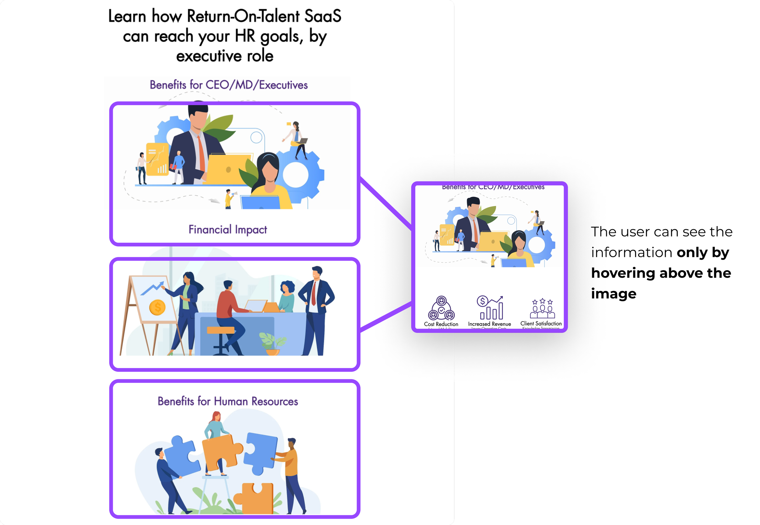
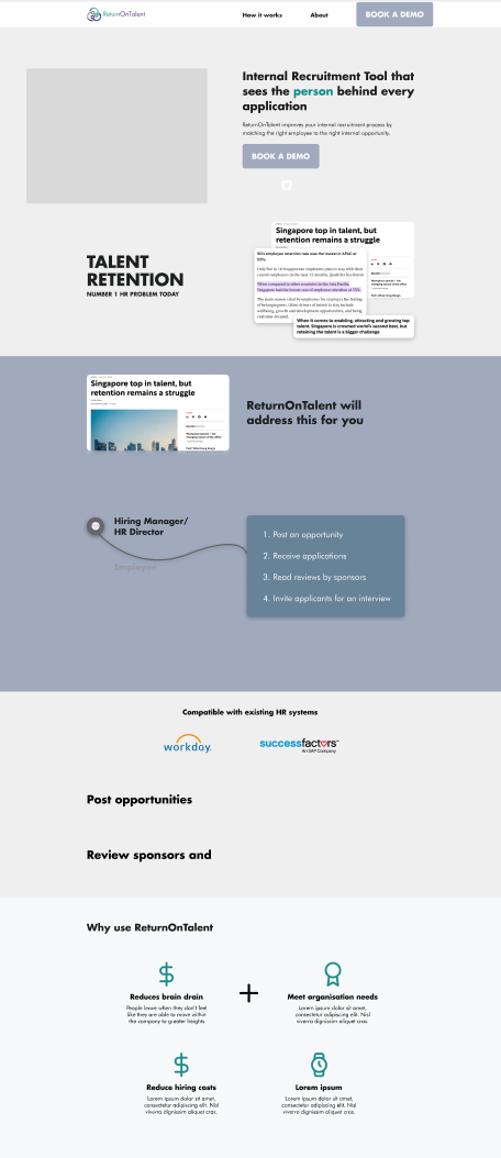
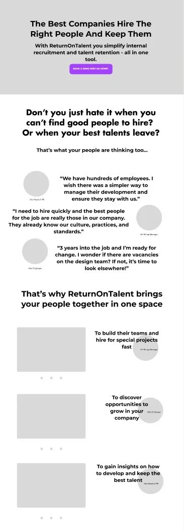
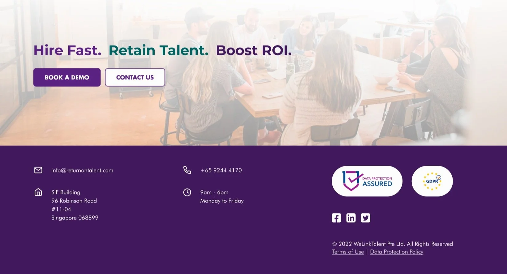
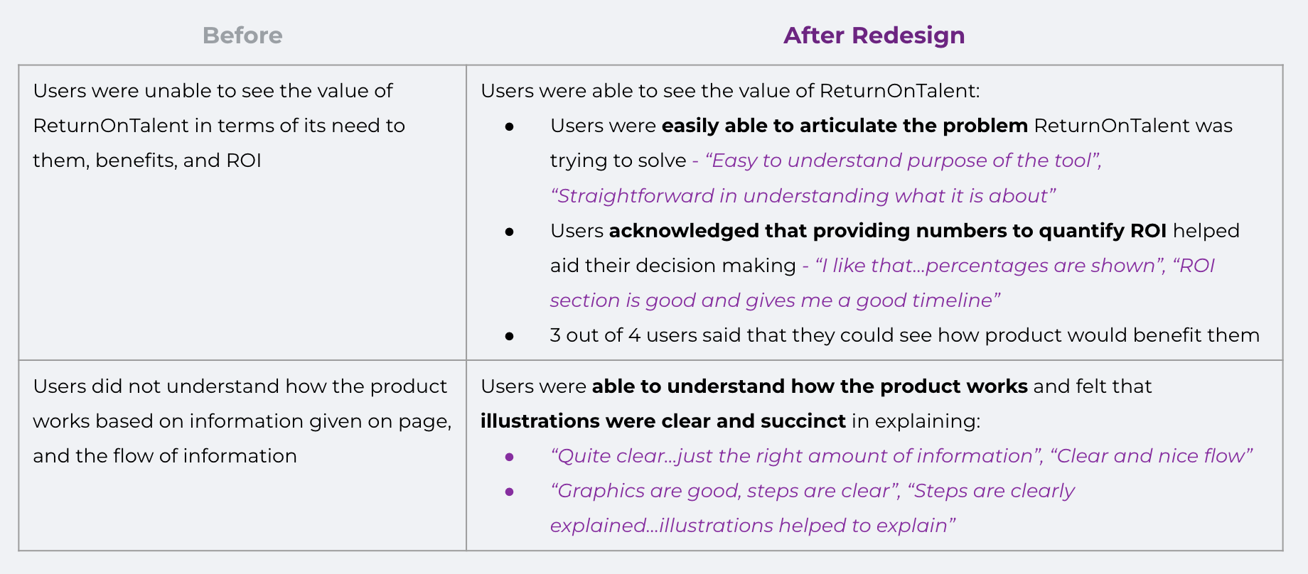
Before
Note: This website was further modified by another team of designers in 2025, resulting in significant visual and functional changes.
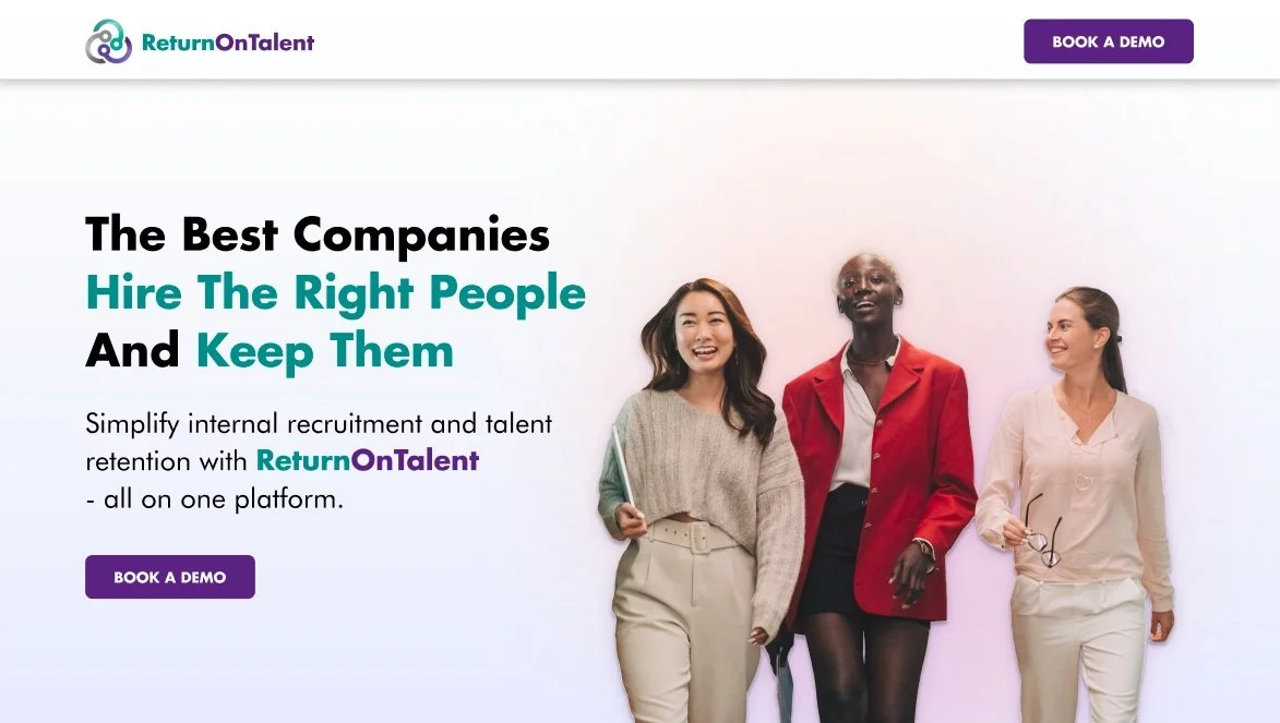
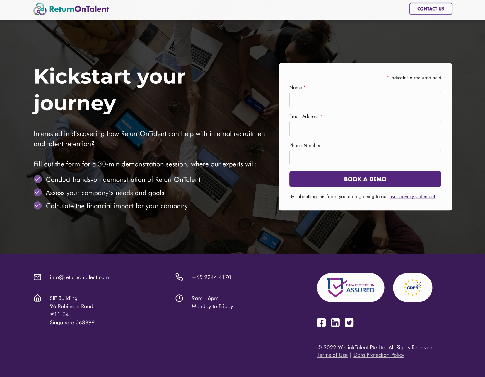
After
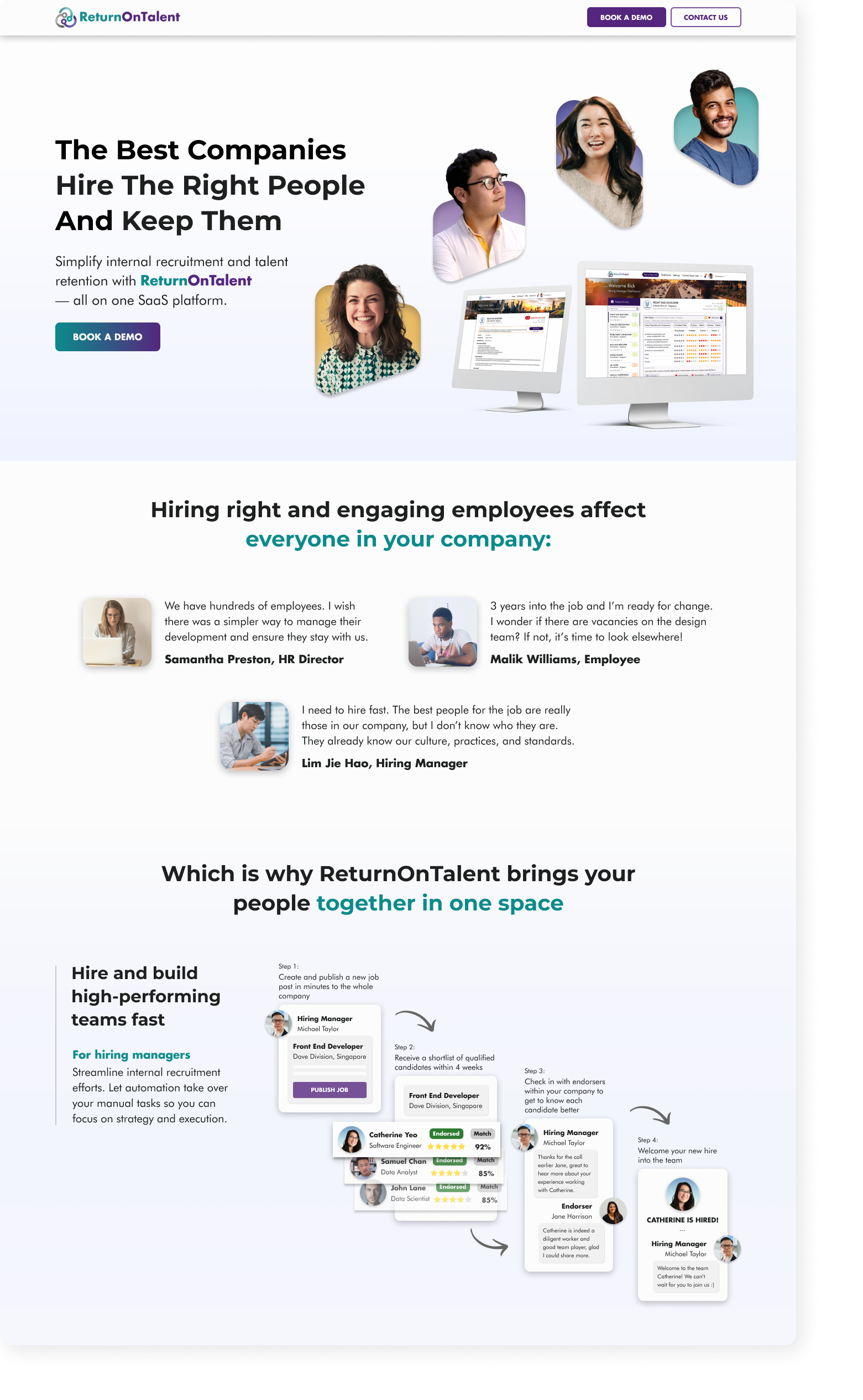
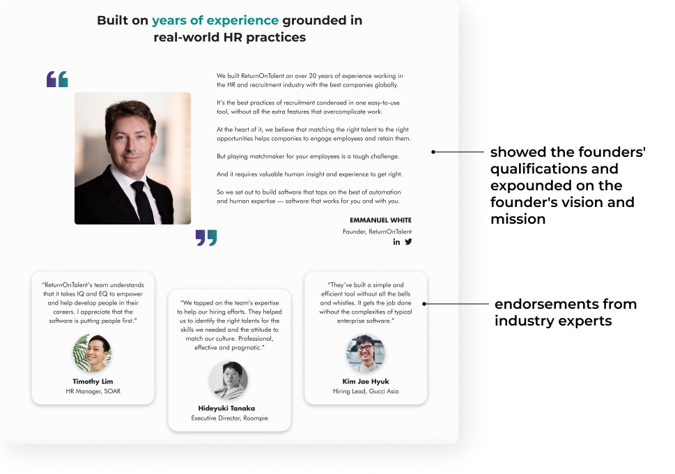
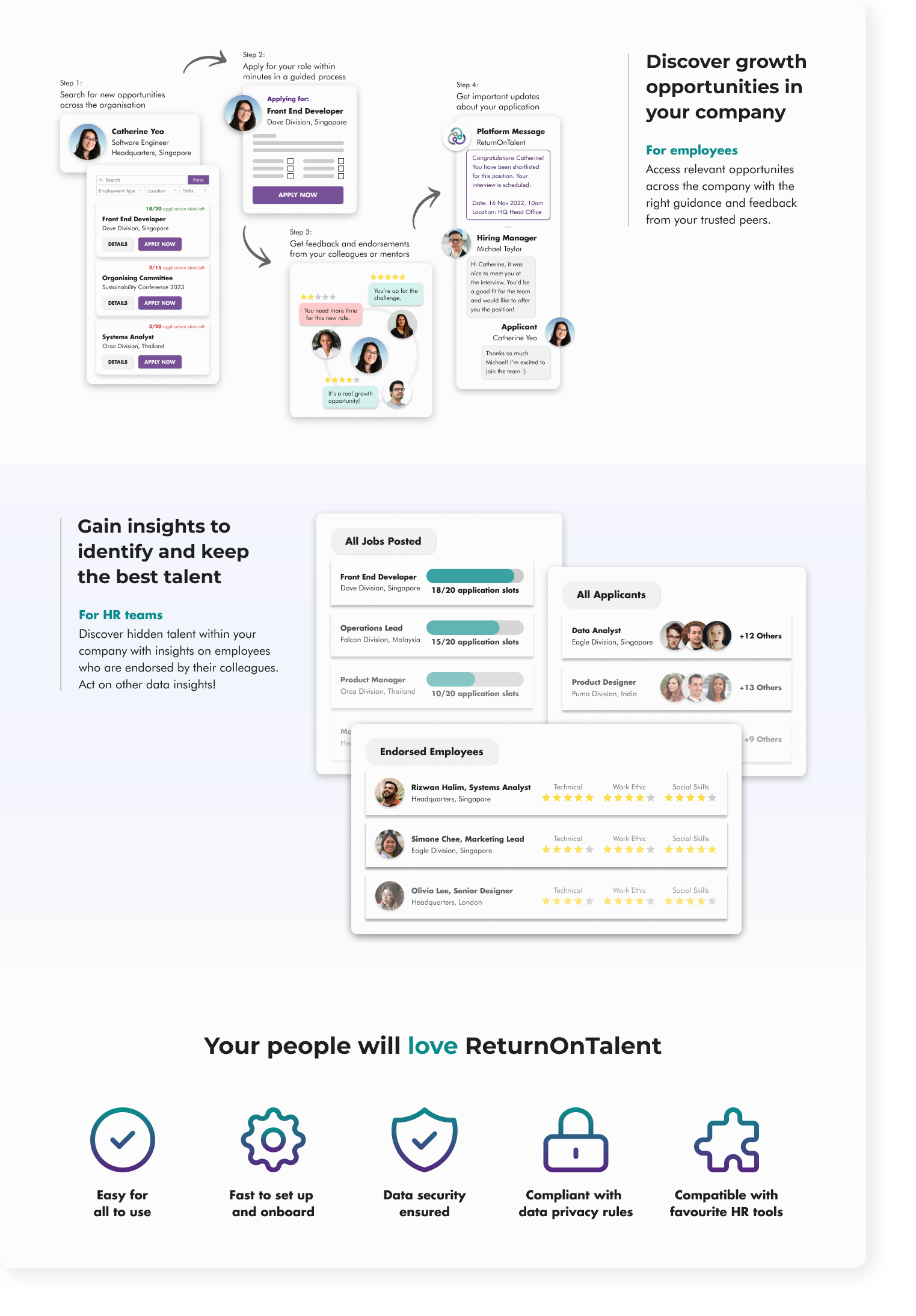
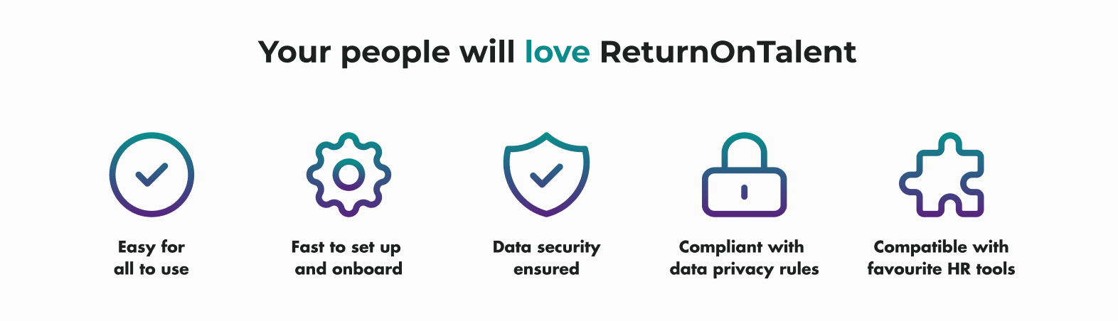
Showed how the product works and its value for the key user personas
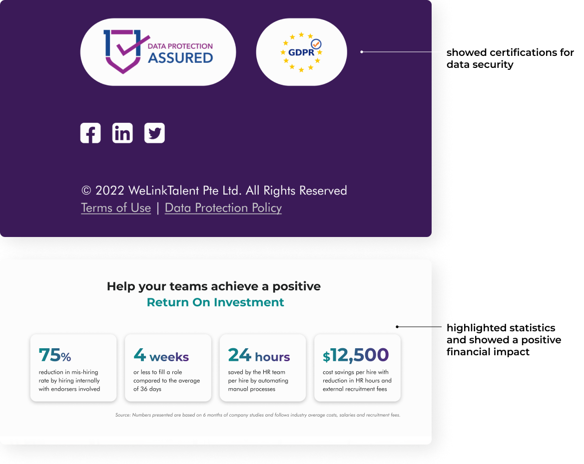
Increased transparency and provided clear information on the data privacy policy

Made sure that information is sufficient enough to aid users in deciding whether or not to book a demo
Impact

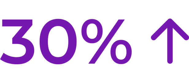
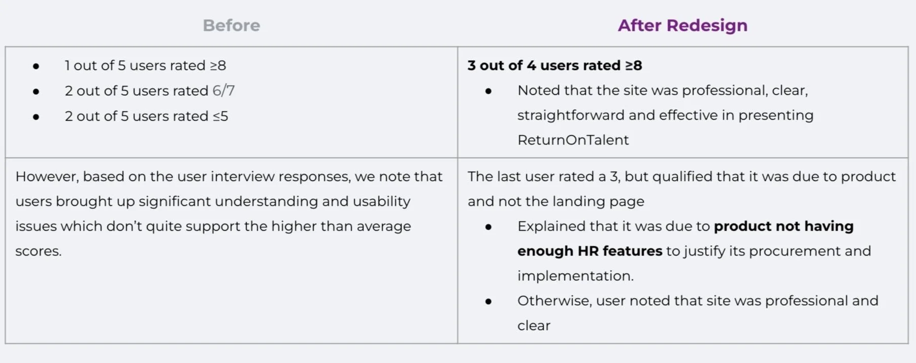
Likelihood to book a demo increased by 30% from a score of 6 to 8
and have noted that the site is professional, clear, straightforward and effective in presenting ReturnOnTalent

Redesign had a positive impact on the user experience, making it easier for potential customers to understand the value proposition of the software, and ultimately, drive more conversions

Desk Research
Before, the content of Return on Talent was separated and distributed across three different pages. A brief UX audit was conducted to evaluate the user experience of the website and identify areas for improvement.
Examining the current website
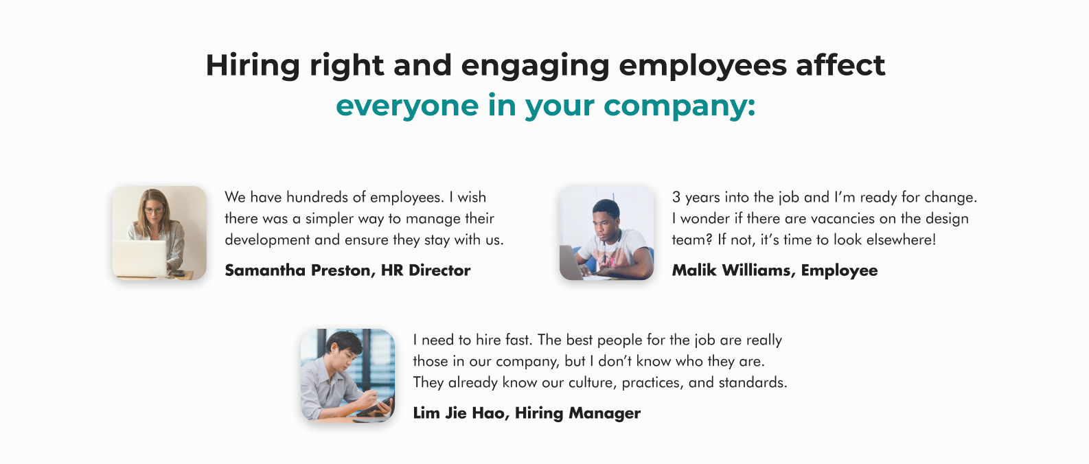
We analyzed the 5 personas created for the platform based on existing research.
Of the 5 personas, that were given to us from the team, we determined that 2 personas: the Hiring Manager and the Head of HR fell within our target users of the landing page.
User Personas
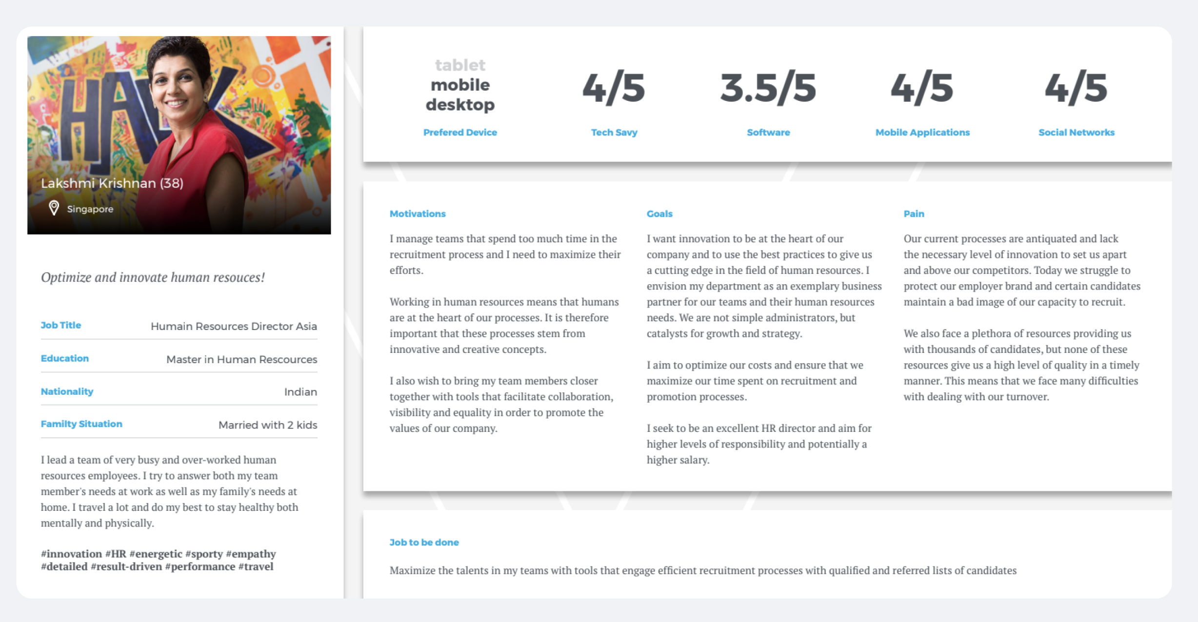

Takeaway:
The personas helped us to understand the goals, motivations, and pains in relation to recruitment.
Competitive Analysis
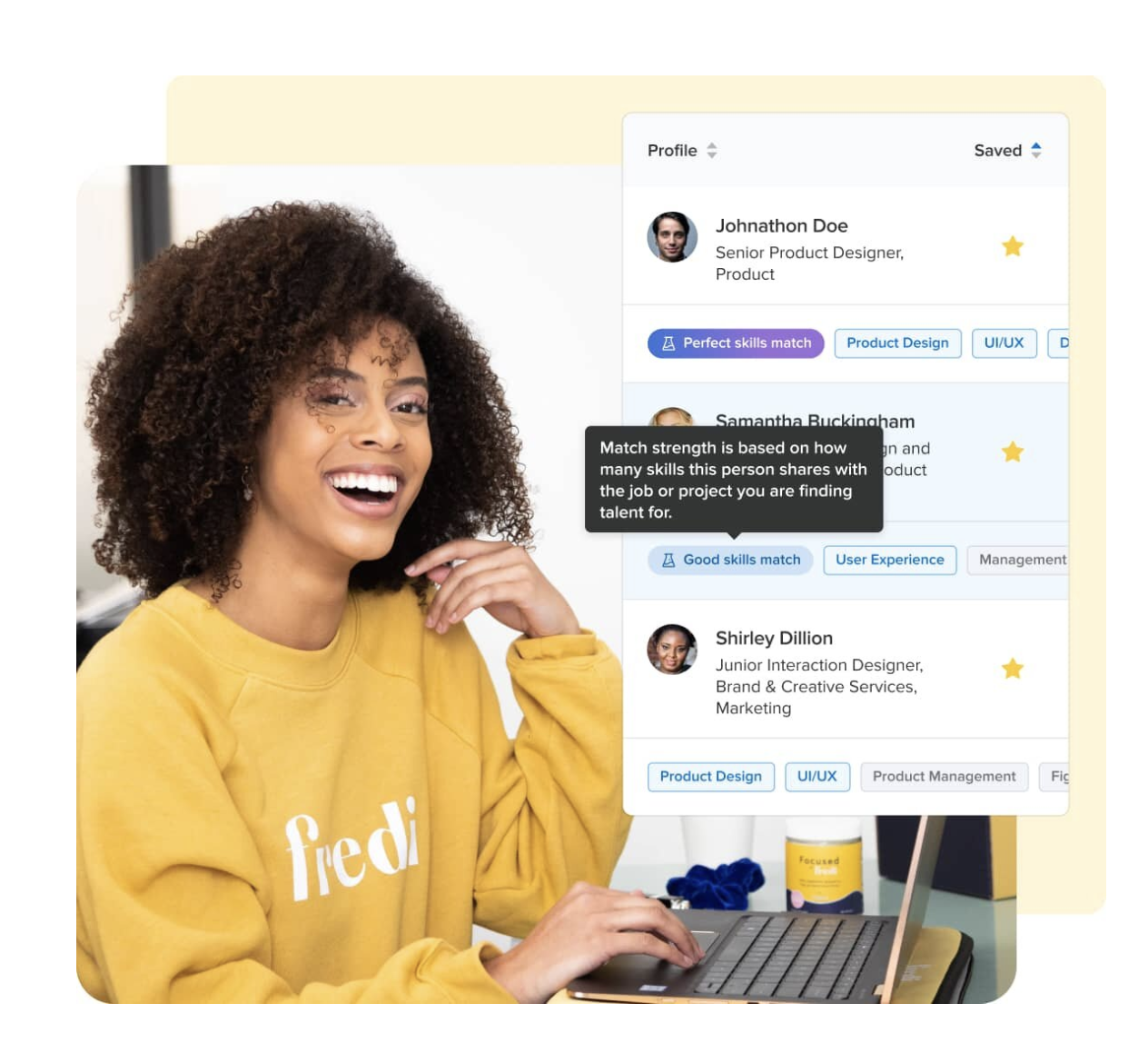
We evaluated the landing pages of 2 other HR platforms: vincere.io and paddlehr.com to understand what product features we needed in order to compare with our competitors.
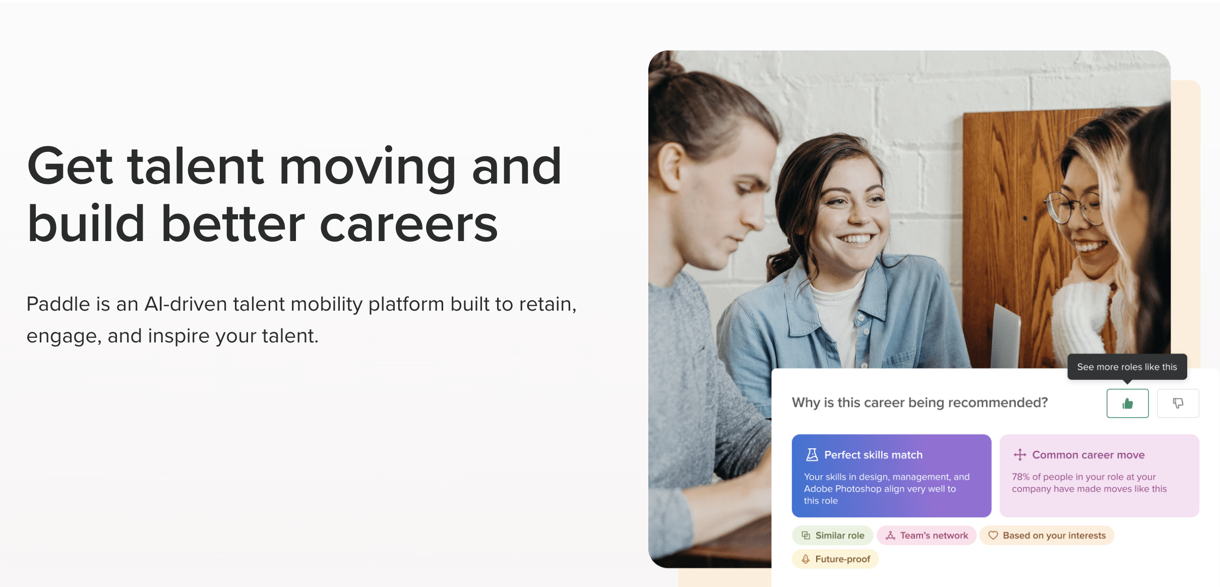
Photos can help to humanize the company and its products, and make it feel more approachable and relatable
Mockups of a product is great way to give potential customers a clear visual representation of what the product looks like and how it works
Contact us form can also help to increase the chances of converting a visitor into a customer, by making it easy for them to get in touch and take the next step

Request a Demo Form is a way for potential customers to schedule a live demonstration of the product with a sales representative or a product expert
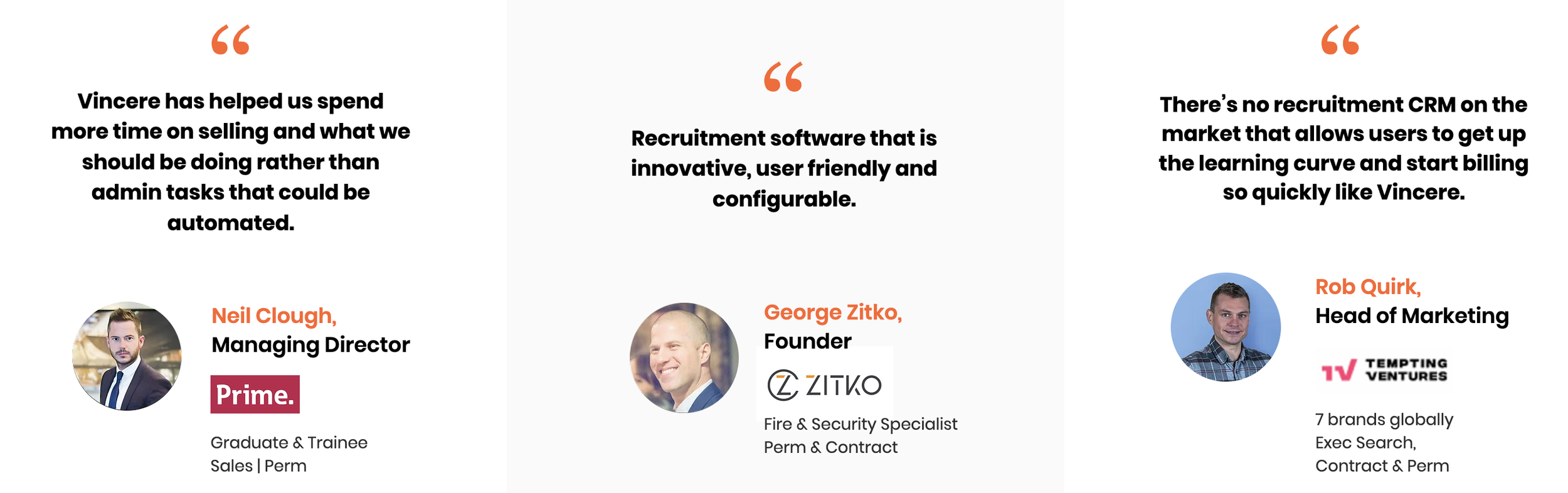
Industry experts are considered credible sources, so featuring their positive feedback on the product can help to establish the product’s credibility and authority, and make it more appealing to potential customers

Company’s certifications, awards, and partnerships can be used to demonstrate that the company adheres to certain standards of quality, security, or customer satisfaction
User Interviews
Following our desk research - we conducted user interviews to find out more specific insights we needed relevant to users’ experience on a landing page. There were three objectives for our research:
Discover and understand what information landing page users are looking for when evaluating product suitability
Identify pain points landing page users experience when looking for information
Evaluate usability of existing landing page
- Is the product's value proposition easy for users to understand?
- Are users able to navigate and find the information they are looking for?
- Can users locate and interact with the "Book a Demo" button with ease?
For our 5 participants, we interviewed those who fit the identified user personas for the landing page. They include a HR Director, HRBP, a former HRBP and 2 hiring managers.
Who we interviewed


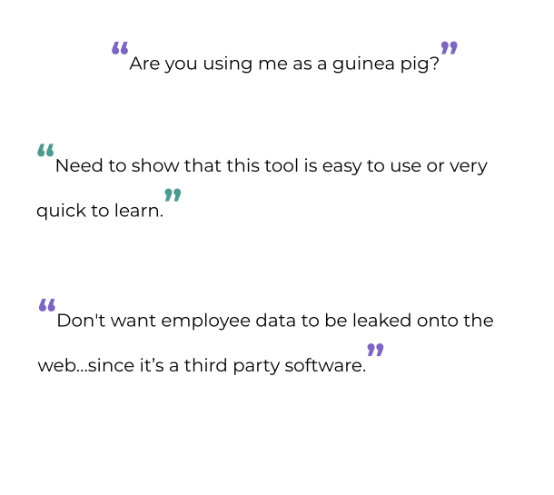
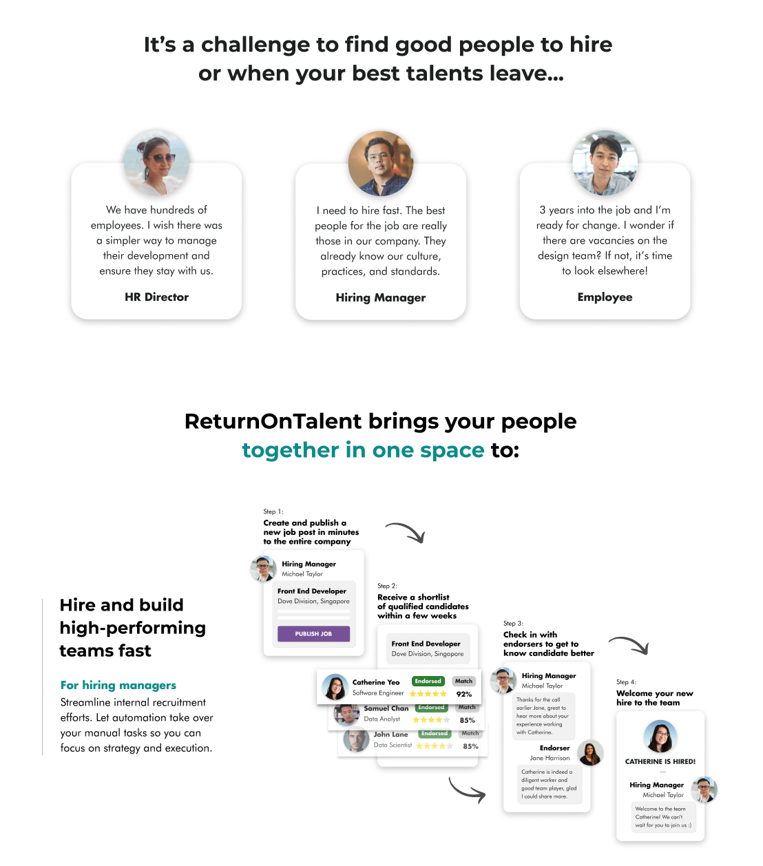
Through affinity mapping we grouped our research findings according to themes, and identified the top 4 patterns from the participants:
Key insights
Users don’t see product value
Users cant see how it works quickly
Users are not confident of product feature
The current landing page’s information is not sufficient to aid users in deciding whether or not to book a demo
How likely are you to book a demo from a scale of 1-10? (current landing page)
Overall score 6
The outcome of our affinity map provided a better foundation for ideation and helped us synthesize insights further and create a problem statement for our design process.
How Might We
enable HR/Hiring Managers/Senior Management to understand the product and be convinced of its value to them so that they will book a demo on the landing page?
Ideation
Each team member created wireframes as potential solutions. These wireframes were designed to address the identified pain points. This was done as a team effort to find the best solution.
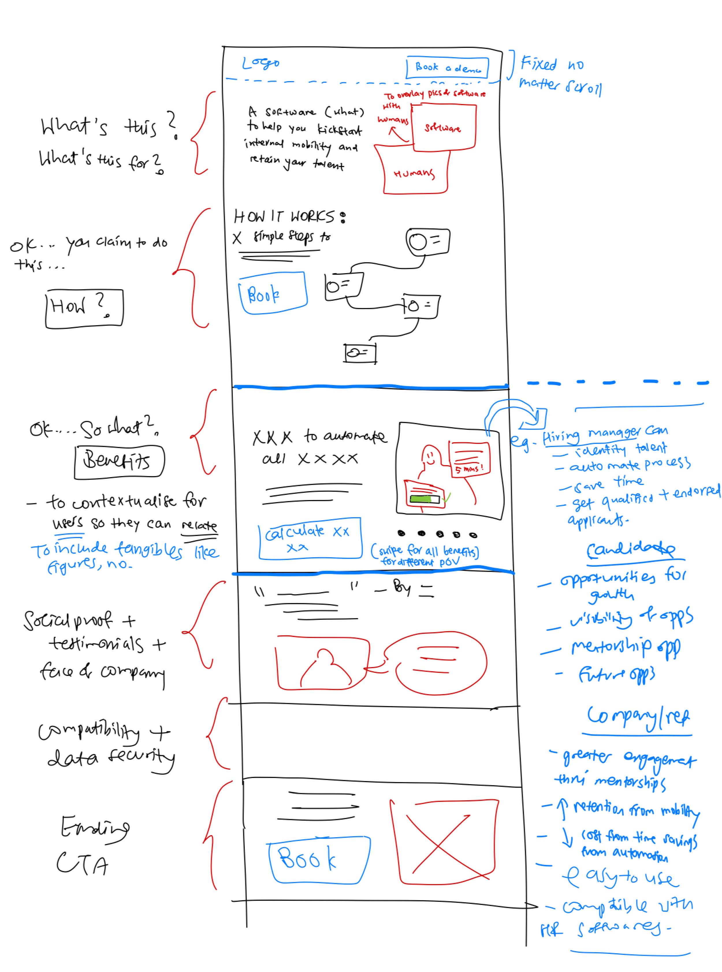

Initial wireframes by each team mate
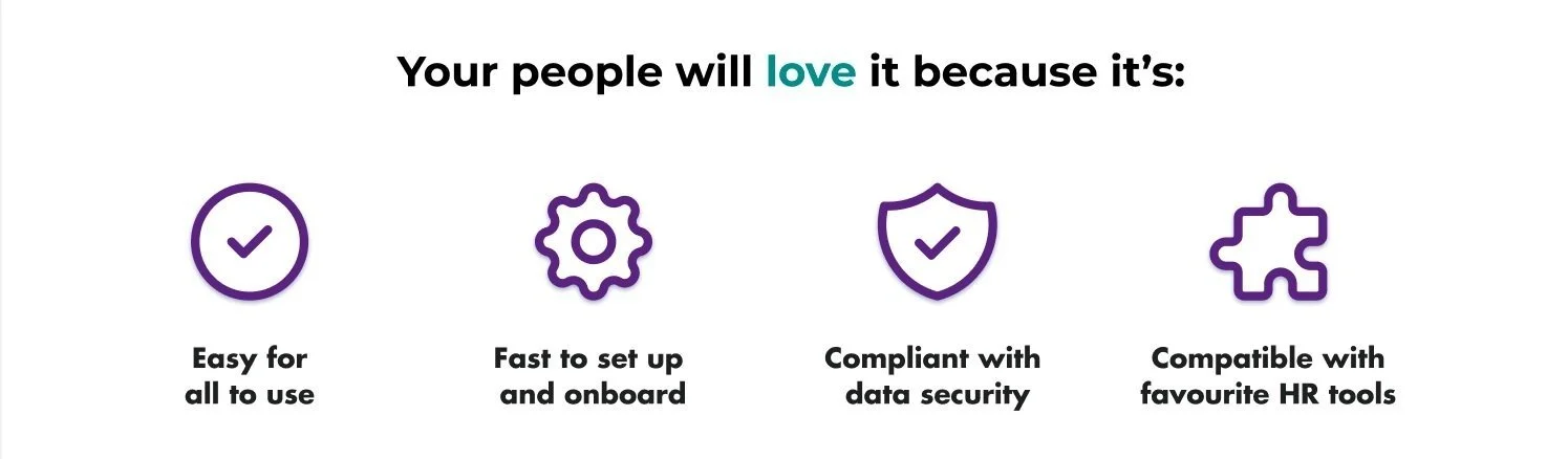
Our team build on a design system using knowledge gained from user research.
The colours are decided based on the colours presented in the ReturnOnTalent logo.
We selected this type scale to be inline with ReturnOnTalent brand appearing professional.
The design system can be utilized to ensure consistent branding for the ReturnOnTalent product, and can be adjusted as the brand continues to develop.
Design System
Usability Testing
We conducted two rounds of usability testing sessions to evaluate the usability of the design, and based on the feedback received, made minor adjustments.
Objectives
Identify any issues users may encounter with the redesign of our landing page
Assess the degree of ease/difficulty users have in comprehending the information provided
Measure the success of the redesign in encouraging users to schedule a demo
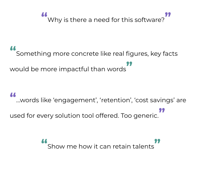
Usability testing: Round 1 findings
Users need more context for financial numbers
In user testimonials - more reference to the product than the founder
Terms like EBITDA are not understood the same across companies
Distinction between ‘Data security’ and ‘Data Privacy’ is important
Client feedback
Some of the copy feels too casual and conversational e.g. “The best part?”
For the images of people, it would be better if there were more Asians and gender diversity
“I would avoid pastel colours, it’s not our preference.”
“I think there are more examples for the financial statistics.”
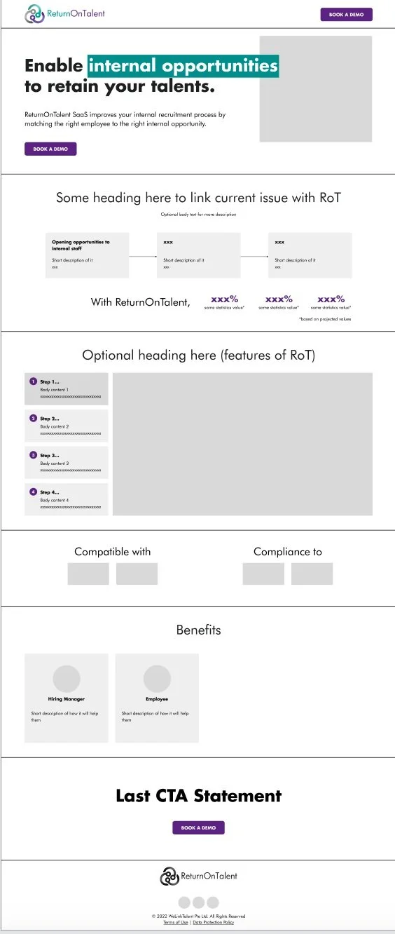
Iterations based on user and client feedback
Before

After the 1st round of UT and client feedback
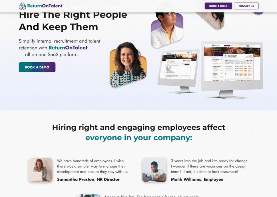
Changed the image in the hero section to feature more diversity in the people and align with the Asian target market
Added desktop image containing platform screens to better illustrate it’s a SaaS product

Changed up the copy across various sections to avoid sounding too casual
Removed pastel background in some sections
Changed data security and data privacy into 2 different benefits*
*Data security focuses on the technical and physical measures to secure data, while data privacy focuses on the ethical and legal aspects of handling personal information.
Usability testing: Round 2 findings
Users need more context for financial numbers
The pain points section looks like the testimonials section
Need to see more on how HR can use it and how is it integrated into their workflow
Need to know that when they book a demo it would not take much time
Final design
Design changes based on:
Cumulative feedback including last round of usability tests

Before
After the 2nd round of UT
Changed the layout and the images so they look different from testimonials.


Added social links to the founder section and minor copy amendments to testimonials so they referred to the product’s team more.
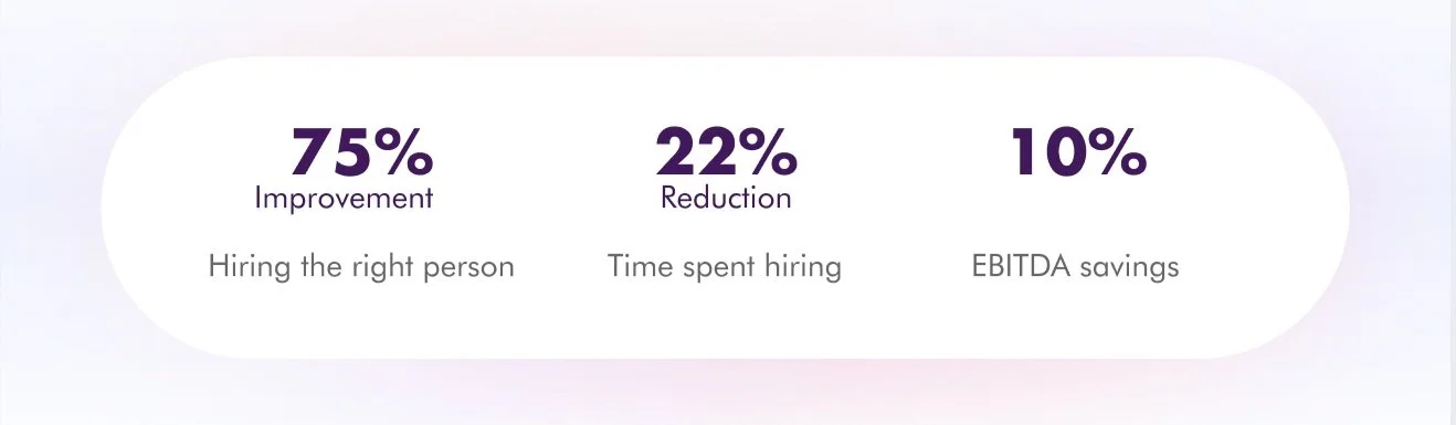

Added context and source for the numbers.
Added 3 actionable benefits in CTA to encourage user action
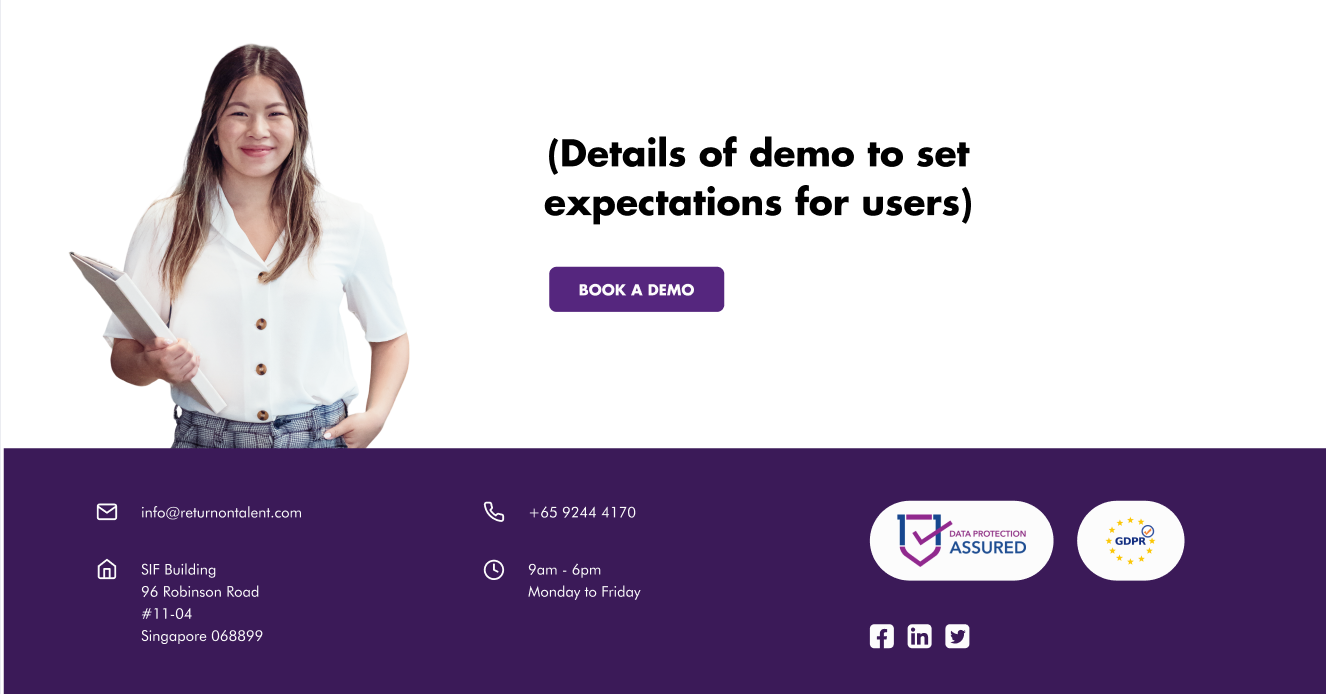
Added footer with more details about the company
Added details to set users’ expectations.
Added “Contact Us” form to make it easier for people to leave a message
View prototype
See the live site
How likely are you to book a demo from a scale of 1-10? (after redesign)
Overall score 8
Design Impact
Given the time constraints faced by our team, our user interviews and tests were limited. We recommend conducting more interviews and tests to further validate the effectiveness of the landing page.
There are 4 main areas where our design helped to address the problem.

In our usability tests, we gave users a scenario to assess the product on the landing page for their company, and asked how likely they would book a demo from 1-10.
Reflections and Key Takeaways
Through two rounds of usability testing, we found that our design interventions effectively addressed the pain points previously identified. User feedback validated this, as the majority of comments were minor suggestions for further improvement rather than major issues. This indicated that we had successfully resolved most of the understanding and usability issues.
One of the biggest lessons learned from this project was the importance of involving the end users in the design process. By incorporating user feedback and testing into the design process, we were able to create a more intuitive and user-friendly interface that better met the needs of the target users.
It's important to effectively communicate the value, usability, and features of your product to potential users, and to provide them with the information they need to make decisions about using it.